UK POS
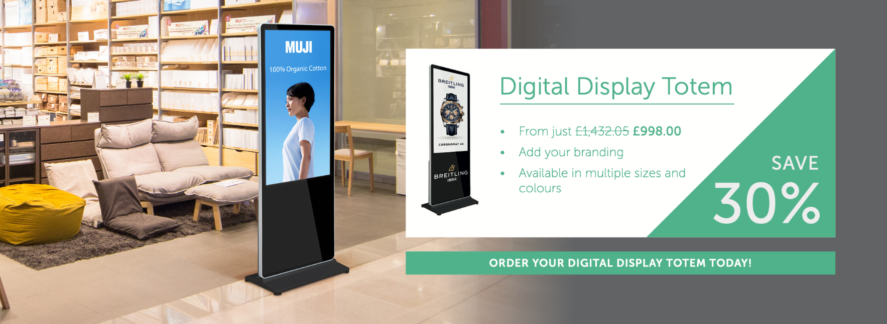
I created some designs as part of an interview process for UK POS. I was tasked with 3 individual briefs, the first was a banner for the home page of the website focused on brand consistency.
I decided to use one of the secondary colours for this banner for two reasons; firstly the location of the banner on the home page of the website will already be in close proximity to the primary colours due to branding on the site. Secondly, the supplied imagery already features lots of orange and grey that is similar to but not the same as the primary colours. The chosen colour from the secondary colour palate complements both the website branding and the image used to show the product in this scenario.

The second was to create a Facebook banner promoting a specific product.

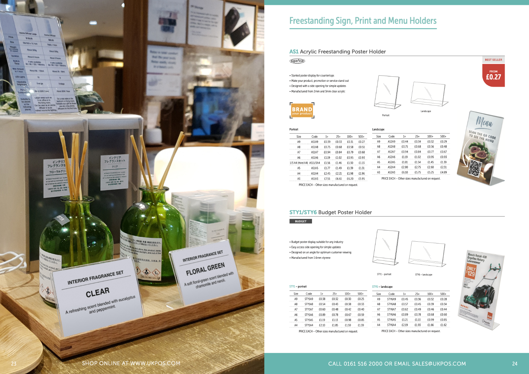
And the final was to rebrand a page of their product catalogue.

I wanted to keep the catalogue consistent with previous versions ensuring brand consistency while reworking the design slightly to give it a fresh look. To do this I made the image full bleed, which would be the case for all full/half page images. The colours running across the top and bottom of each page indicate the section and each section starts with the header in the sections colour as shown, with product titles using the sections colour to highlight the product code.

